Saker Music case study

The client
Saker Music Company publishes music that has never been published before. Their portfolio includes brand new compositions, as well as arrangements of existing music. They strive to satisfy the needs of beginners and professionals, as well as those who find themselves somewhere in between, at a high quality. Also they make video recordings with some of the world’s most exciting brass artists.
The problem
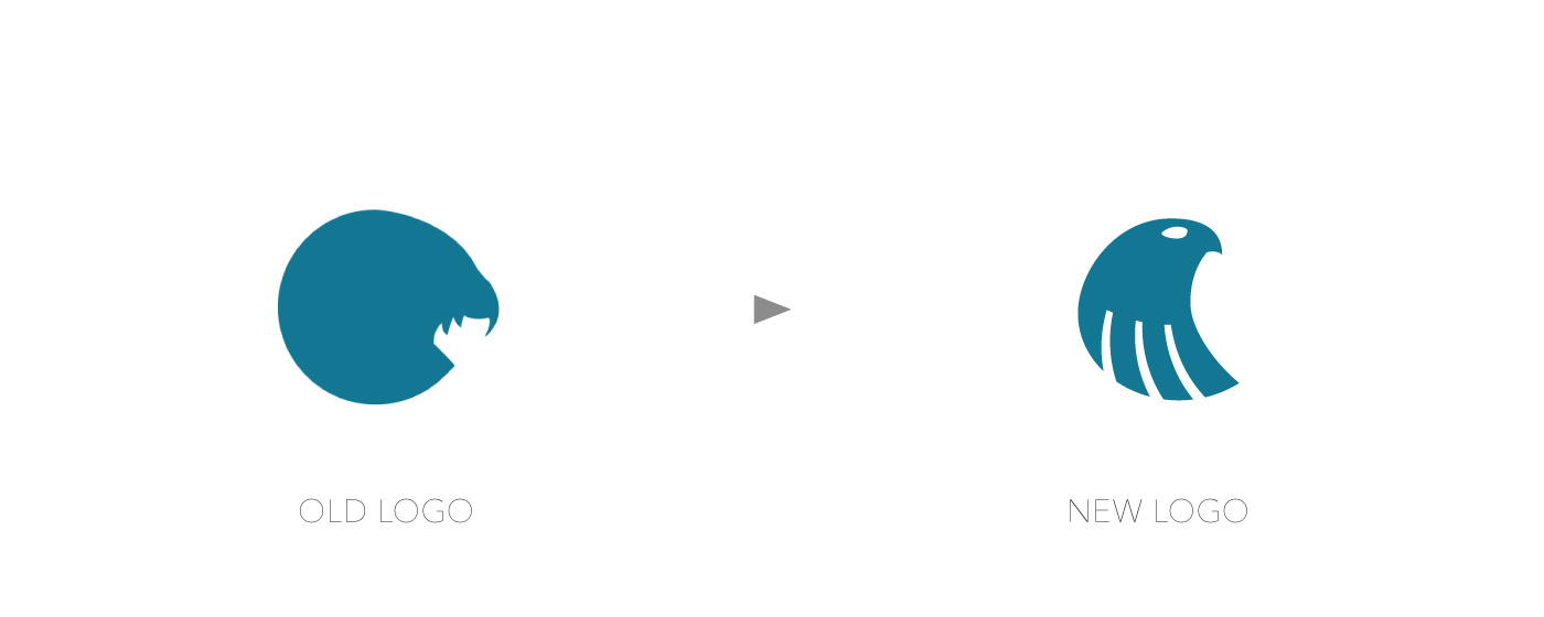
Their current logo wasn’t identifiable for the most of their audience, so they wanted to keep the saker symbol, but represented in a more recognizable way and they also wanted to look more professional as their arrangements are professional at a high quality.
1. Discovery
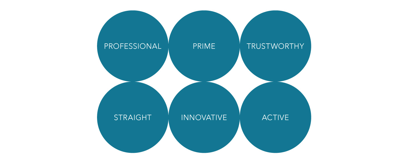
2. Design direction

3. Designing
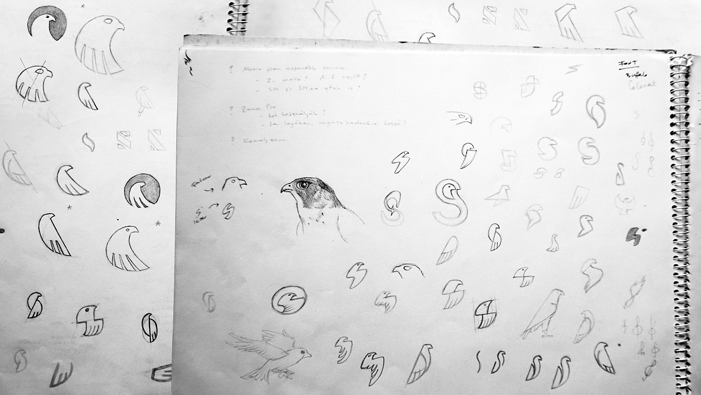
Considering the above and keeping in mind that Saker Music wanted to keep the bird in the logomark I started sketching on paper. I never show these sketches to clients because it’s not that phase, not that quality. These are raw ideas and usually a client could hardly see them as functional logo concepts. (So yes, now you’re seeing behind the scenes.)
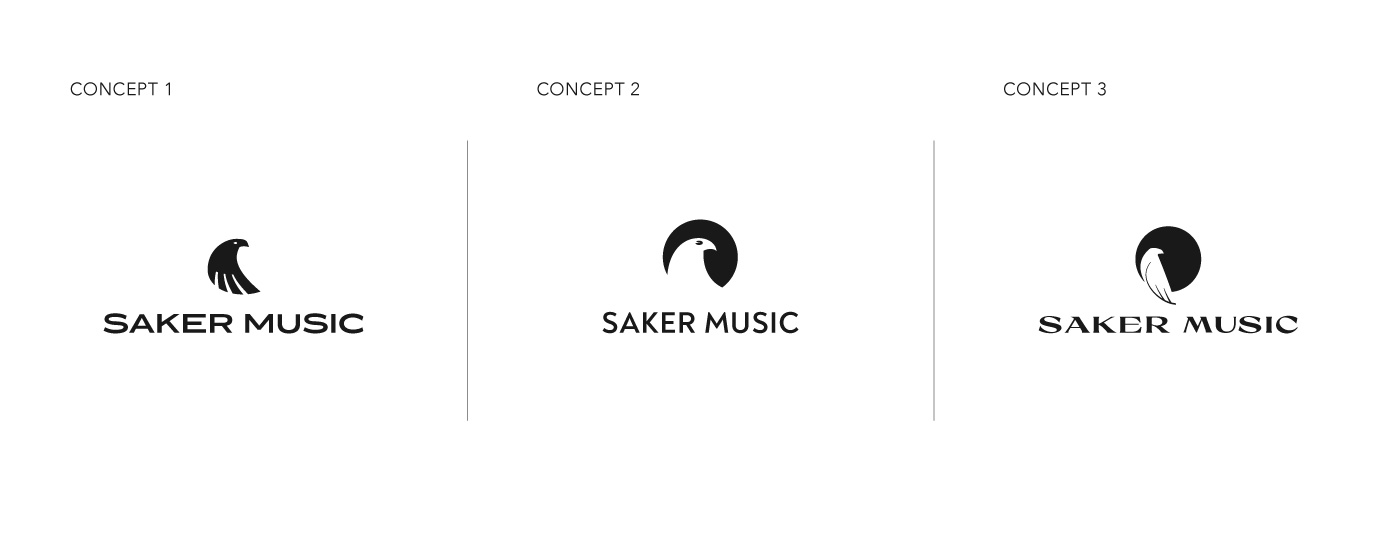
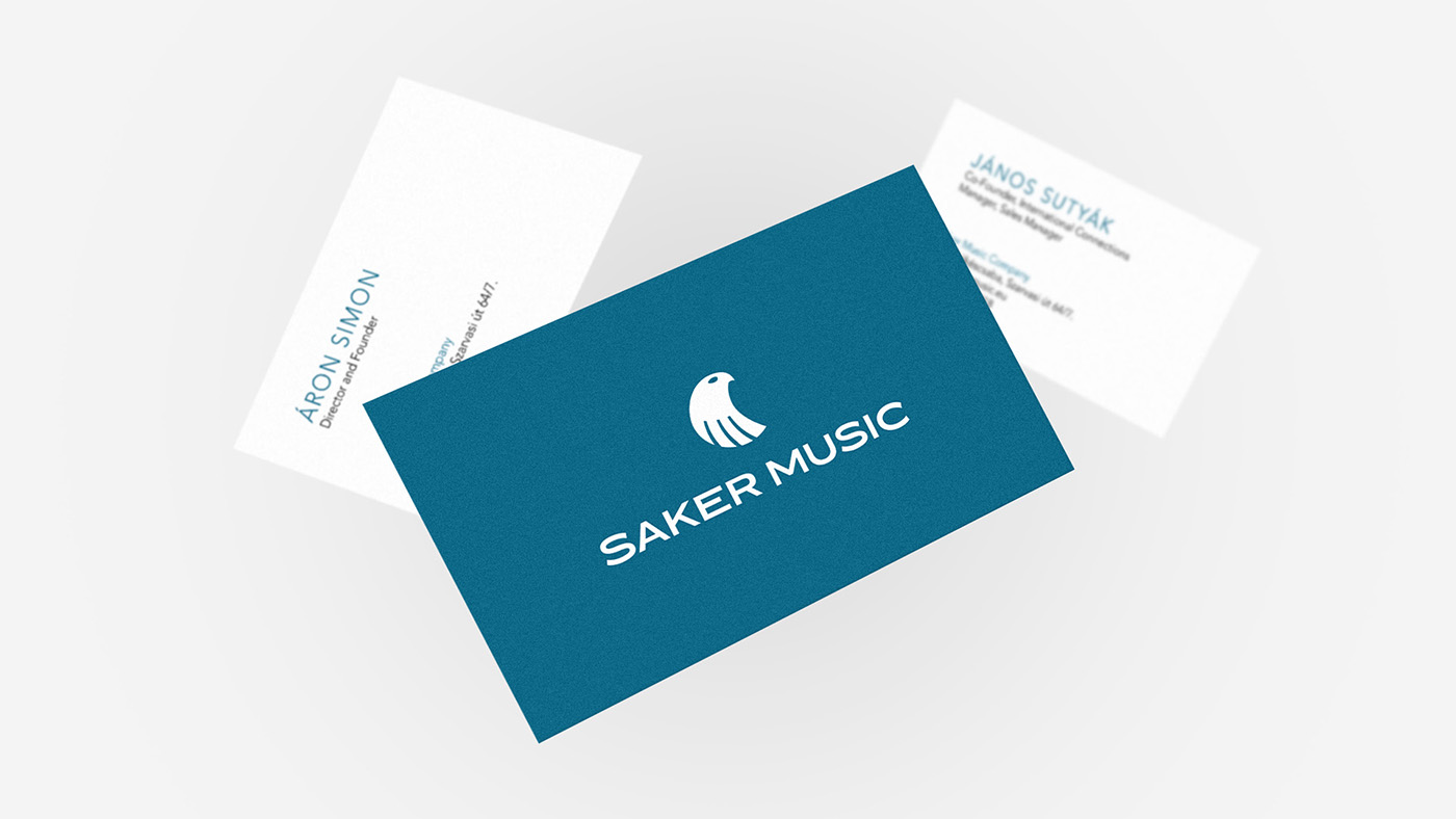
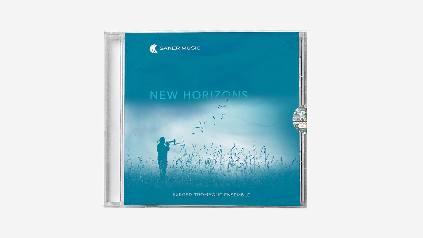
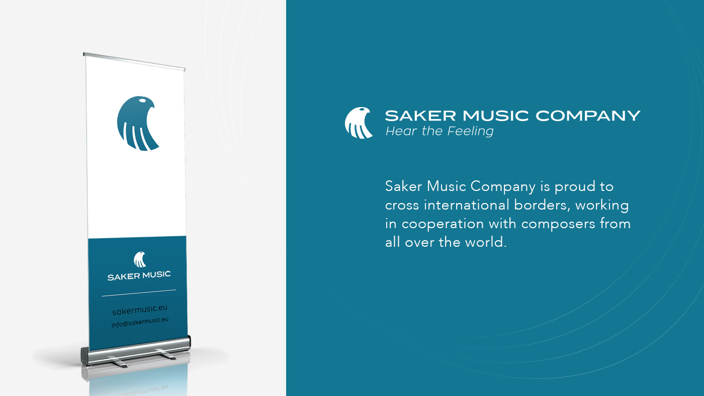
After choosing some promising ideas I cleaned them digitally, looked for appropriate fonts and made a presentation including our stylescape as a foundation, three logo concepts in black & white and colours, and also made mockups which help the client imagine a logo in real life.
4. Consultation
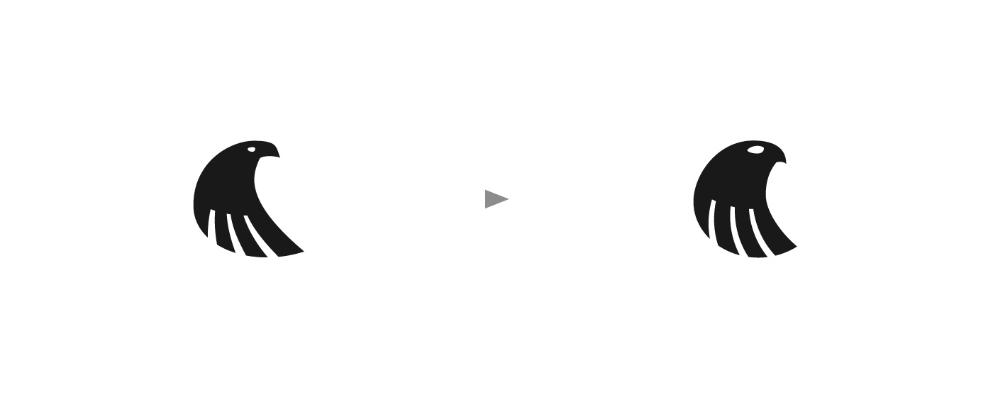
From the presented concepts they chose Concept 1, but asked for a revision as they found the logomark more similar to an eagle than a falcon. And they were right.
5. Release
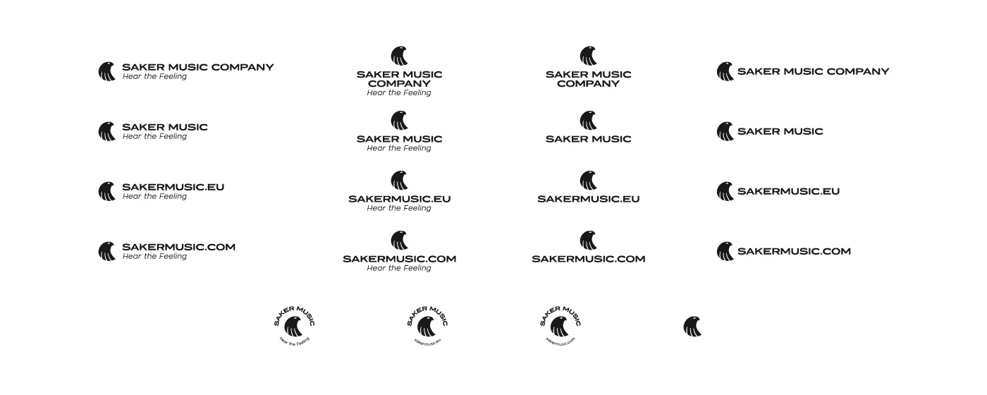
After revision the logo design was approved and I developed the final files in all necessary formats, colours and layouts. The whole process, including discovery, design and the end result made both the client and me satisfied.
Testimonial
This logo redesign has been featured on the DesignRush page.